colucent environmental
How do you shine a light on a path forward?
CHALLENGE
The founder of Colucent Environmental approached us with a creative challenge for his new business: to create a transformative identity that didn’t look or feel like a traditional consultancy within the environmental sector.
INSIGHT
The word Colucent means “to glow” or “give off light”, so we developed a brand that did just that.
IDEA
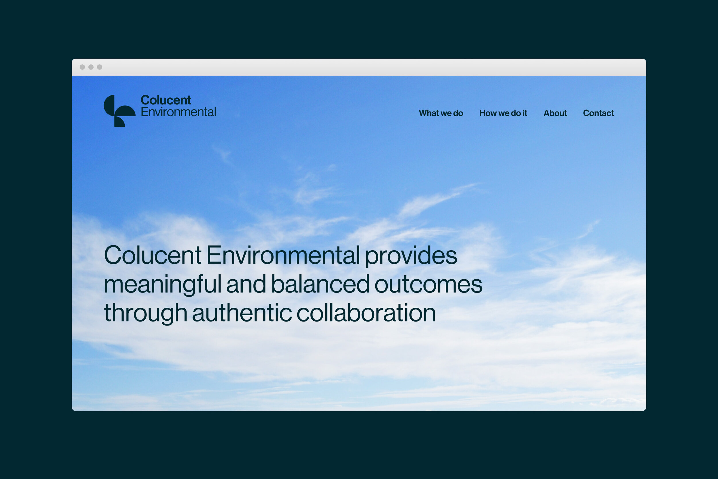
The symbol is both a combination of the c and the e, and the overall shape is reminiscent of a “wind turbine”. The colours blue and yellow, represent the sky, water and sun - the necessary elements in which an environment can thrive.
Due to the COVID-19 networking restrictions, our client launched the new branding virtually, with a set of beautifully designed postcards mailed to colleagues and previous clients. This directed them to a single page website - a continuation of the collage motifs.